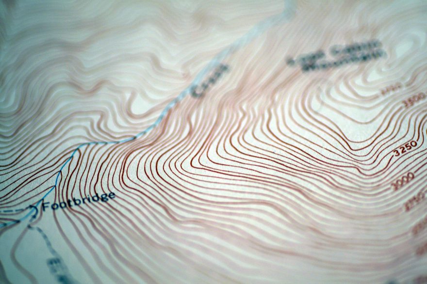
The colors and lines on a good wilderness topographic map can be overwhelming if you don’t have a lot of experience with map reading. There is so much information to process on these kinds of maps, and being in the backcountry, when you’re tired or hungry, isn’t the time to learn these skills. Like anything of value, map reading successfully takes practice. With some prep and the right tools — namely a good compass and the map itself — you can become proficient at understanding what the colored lines and scale readings mean on today’s maps and will be able to interpret them when you need to the most.
This piece is the fifth in a series that’s intended to shed light on map-and-compass skills. While the compass as a tool is over a thousand years old, it is still a handy item to master to keep from getting lost. This series covers the following discussions: (1) Compass Selection; (2) Using an Orienteering Compass; (3) Cell Compass Apps; (4) Declination; (5) Map Reading; (6) Map and Compass.
Part 5: Map Reading
Uses
Most people look at maps to figure out a few things. They usually want to know where a particular location is, and they want to decide the best route to get there from their current location. This can be easier said than done, especially if you intend to go off a travel route like a trail or road. If the latter is your intent, please take a map with you, and learn how to read it before stepping off.
Types
There are many types of maps out there; their variety is limited mainly by imagination. Your interests or needs will determine what type of map would best serve you. Road maps such as those created by Rand McNally or Google Maps display primarily on-road information that is most useful to folks in vehicles. Topographic maps use the horizontal area as an indication of distance and contour lines as a means to express a third dimension of elevation. Aerial maps display images of portions of the Earth’s surface as photographed from plane or satellite. The aforementioned third dimension of elevation is usually difficult to interpret from purely aerial maps.

Figure 1. A section of a USGS topographic map with a coordinate grid.
Hybrid maps can combine any number of these and other layers to give a more complete set of information about an area. A creator of a hybrid map may be able to, for example, use an aerial image as a base layer, and then add in additional layers such as topographical features, property boundaries, and a coordinate grid to create a very useful map for planning or operational purposes.

Figure 2. A hybrid map with topographical, aerial, property and coordinate layers.
Orientation
Maps are usually made so the top of the map is oriented towards geographic north. There are certainly exceptions to this, such as popular trail maps (e.g. Appalachian Trail) that are oriented in ways to maximize the length of the trail on the map.
Quality
Like anything else, there is a spectrum of map quality from flimsiest to best. A few factors play in to deciding where on the scale you want your map to be. Those factors include material (e.g. paper, waterproof, etc.), symbology, and marginal information such as North arrow (up to three is the best … one for true north, one for magnetic north, and one for grid north if there is a coordinate system on the map), scale, date of map creation, etc.
Scale
Most maps, especially the good ones, have a unitless scale that is shown as a representative fraction (e.g. 1:24,000). Map scales can range widely from 1:5,000 up to 1:250,000 or any scale at which someone wants to make a map. This scale indicates what one of any unit of length (e.g. centimeter or inch) on the map represents for a distance out in the real world. For example, a map with the scale of 1:100,000 means that 1 inch on the map represents 100,000 inches out in the real world.
Scale ratios are often conducive to the imperial measurement system (e.g. 1:24,000 means 1 inch on the map represents 2,000 feet in the real world), or the metric system (1:50,000 means 1 centimeter on the map represents 500 meters in the real world).
Scales can also be shown in the form of a bar that gives a set length on the map, and the number of feet, meters or other unit that is represented by that length on the map for a distance out in the real world.

Figure 3. An example of a USGS topo map showing scales as a unitless ratio (1:24,000) and as a distance on the map (bar scales).
Symbology
Most road maps are pretty straight forward, with the biggest difference being the symbols used to distinguish various types of roads. An introduction to topographic symbology starts with color codes.
In most topographic maps, including those produced by military resources and the United States Geological Survey (USGS), these colors are used for the following symbol categories: Blue features are water features (e.g. ponds, streams, rivers, etc.), black and red are used for man-made features (e.g. structures, roads, etc.), green and white layers are used for forested and clear areas, respectively (see figure 1). USGS maps will also use purple to indicate a revision to an original map layer such as a newly developed area.
Typically, the most difficult symbol to interpret uses the color brown; that is for terrain features such as contour lines. Whatever the given elevation of a particular line is, contour lines connect all points of the same elevation. Index contour lines are thicker and can be traced to a number that usually indicates the elevation of that line above mean sea level in feet or meters. The thinner contour lines are the intermediate contour lines, and their elevation can be determined by finding the nearest index contour line and knowing the contour interval. The contour interval is the vertical change of elevation between two contour lines, and it is expressed in feet or meters.
Contour lines show the elevation changes and features like hills, saddles, ridges, valleys and depressions on a flat piece of paper. Entire books and field manuals are written on these topics, and they are the ones that need the most field time to learn how to read correctly.
Conclusion
Except for the one displayed on our device with a blue dot that shows where we are and a connecting line to where we want to go, Maps are seeing less use nowadays. If that resource is either unavailable or lacks the information needed to navigate from here to there, having and learning to use a hard copy of a map can be a useful skill. My recommendation is that you find a map for your area and become familiar with it. One free resource from which you can print such maps is https://sartopo.com/. Good luck and safe travels.
Rob Speiden is a professional search and rescue volunteer who has participated in over 330 searches since 1993. He teaches land navigation, tracking and other SAR classes for both the Virginia Department of Emergency Management and his own Natural Awareness Tracking School. Rob has written two books on tracking humans for SAR: “Foundations for Awareness, Signcutting and Tracking” and “Tracker Training.” More information about Rob’s books and classes can be found at www.trackingschool.com.
 Your Privacy Choices
 The
The